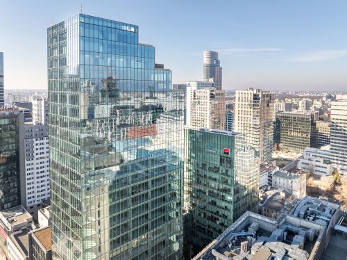
New office space of Jeronimo Martins in Warsaw: minimalist interior, futuristic shapes
schedule 13 August 2014

1 / 11
2 / 11
3 / 11

4 / 11

5 / 11
6 / 11
7 / 11
8 / 11
9 / 11
10 / 11

11 / 11
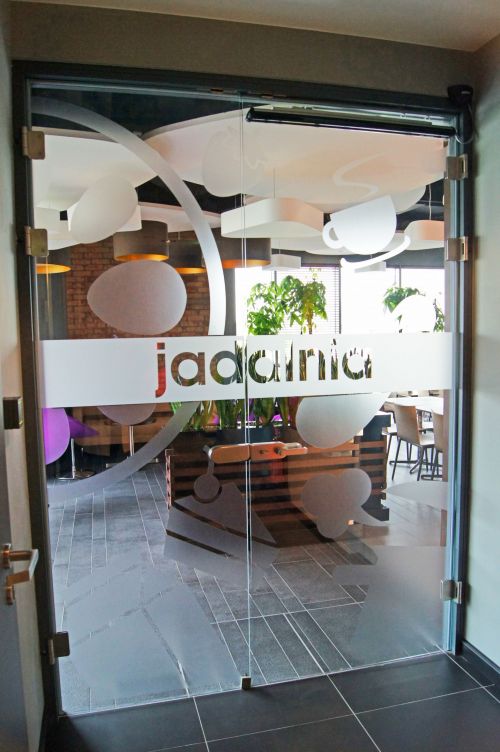
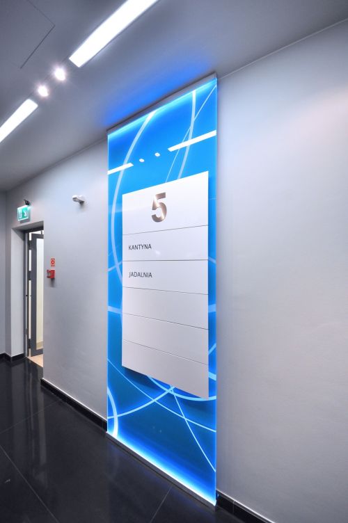

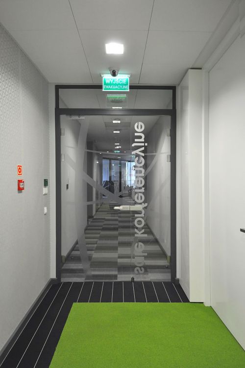
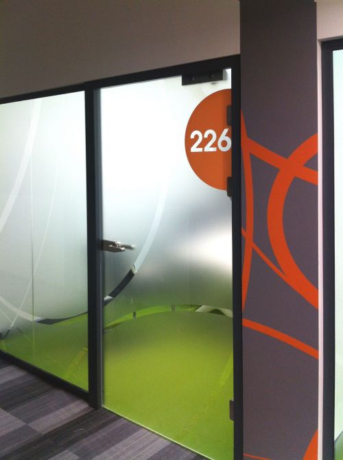
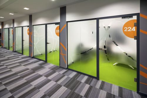
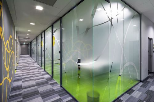
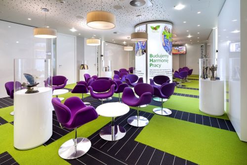


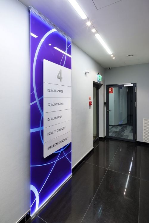
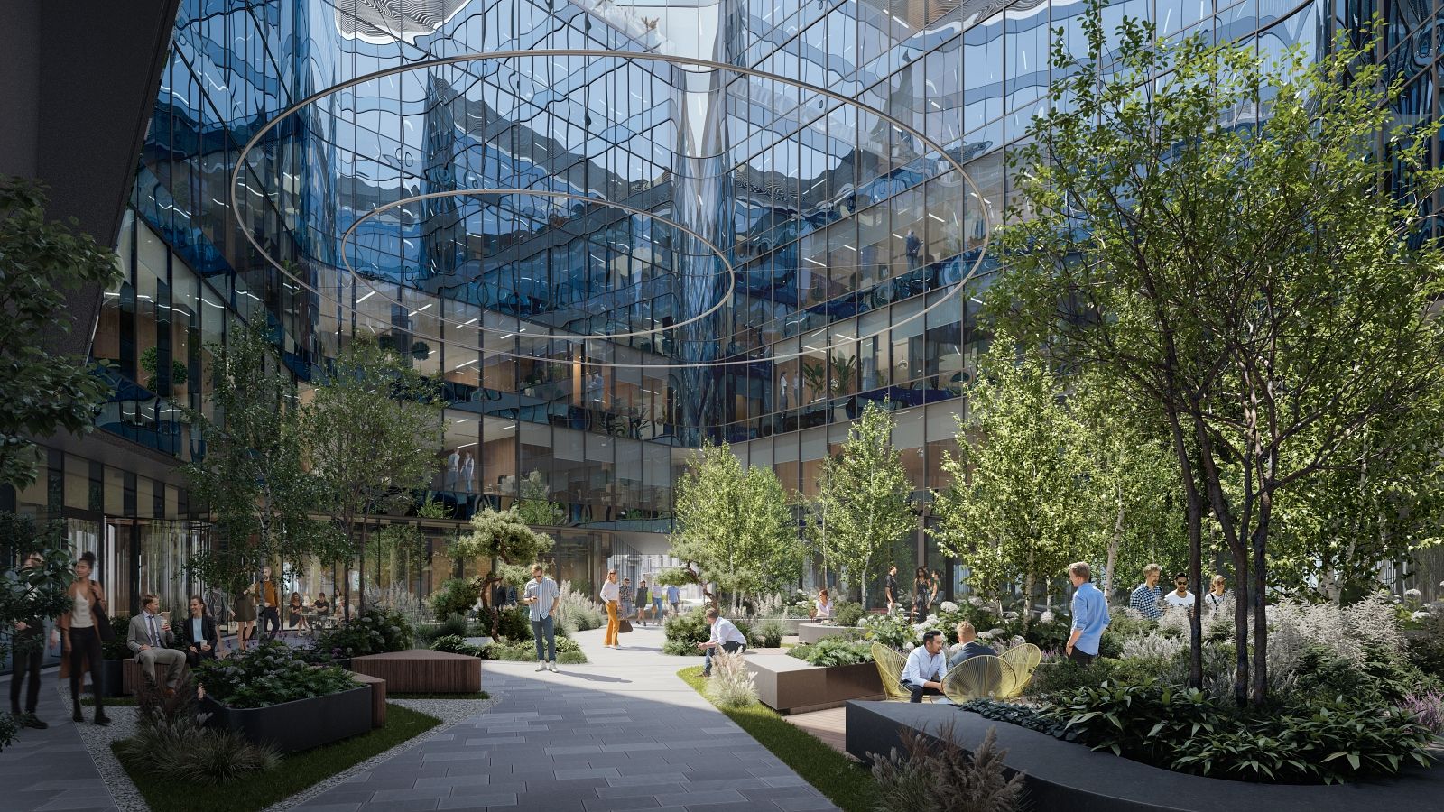
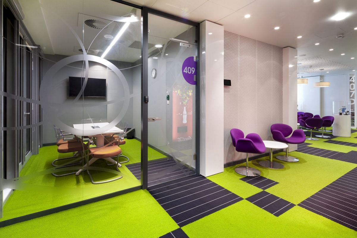
Jerónimo Martins head office on ul. Dolna in Warsaw has been refurbished in a modern and minimalist style with futuristic elements.
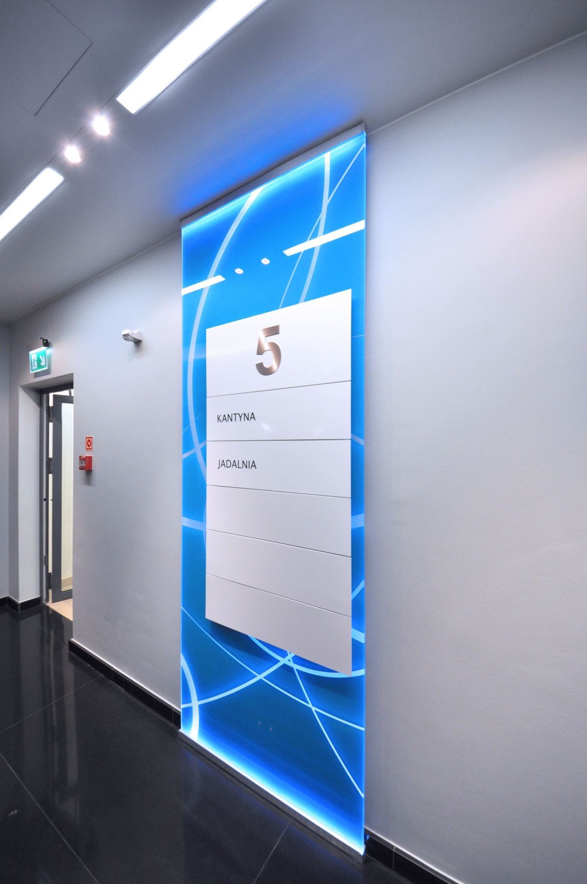
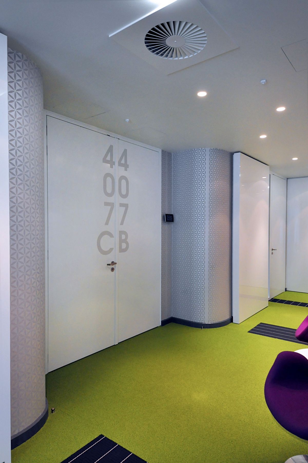
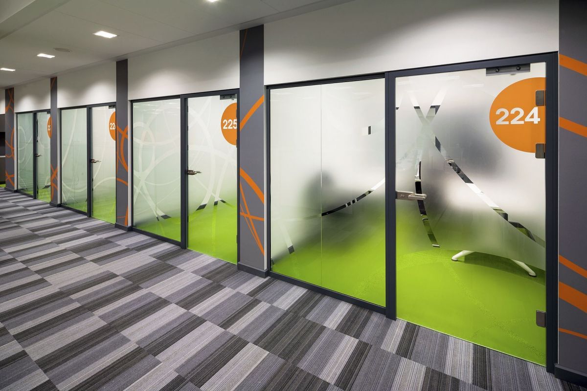
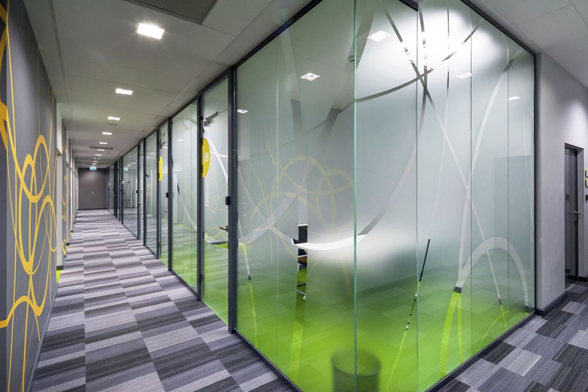
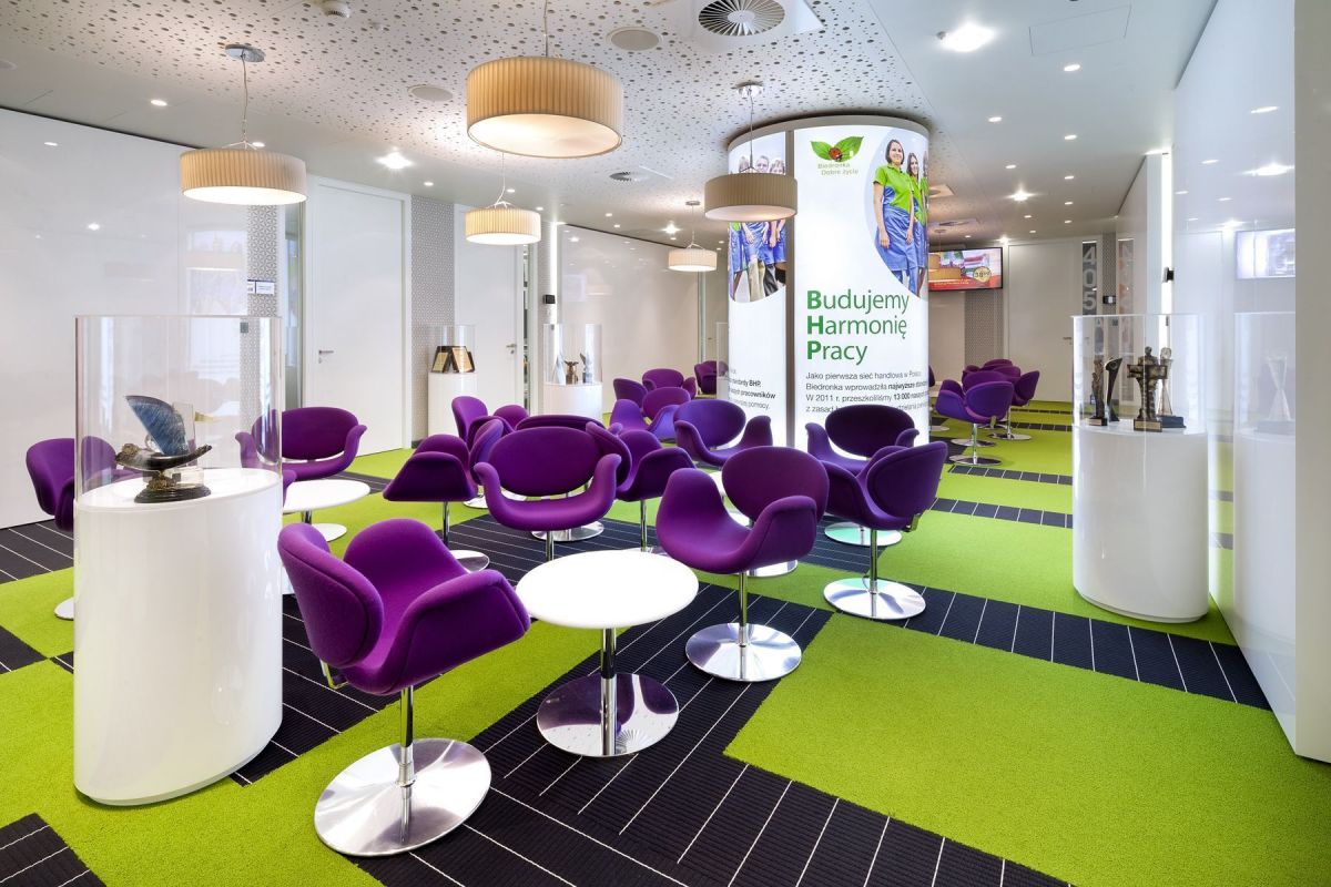
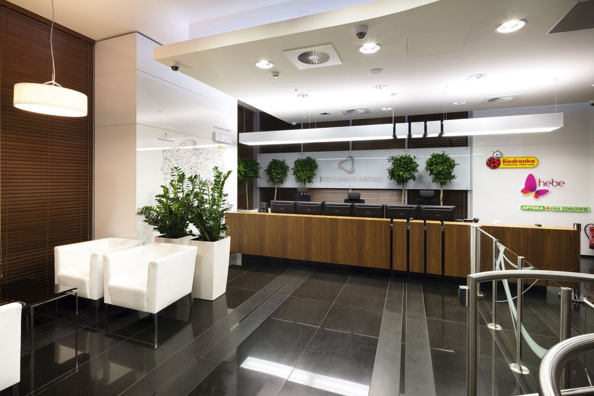
The décor features repeated glass motifs and decorative foil appliqué designs with a sandblasted effect. Each of the floors of the offices now has a different colour. The new main logo of the company is made of stainless steel applied to glass and has been placed above the reception area, where the logo of other brands of the group have also been displayed. A map of Poland has been mounted in the reception marked out with all the locations of Biedronka stores. In the guest area an LED-lit column with exchangeable graphics has been installed, displaying the company’s social responsibility principles and the pillars of its operations. The re-design project took several months and was divided into a number of stages: the first to be completed were the window graphics, the reception area and the visual communication system, as well as the waiting room for guests on the fourth floor. The final stage involved the renovation of the management area. In 2014 Jerónimo Martins Polska’s head office obtained a Green Office certificate. The KSArchitekci studio was responsible for the design of the entire office area, while the installation of the décor in the reception area as well as the office identification and information system were the work of Grupa Advertis.
The décor features repeated glass motifs and decorative foil appliqué designs with a sandblasted effect. Each of the floors of the offices now has a different colour. The new main logo of the company is made of stainless steel applied to glass and has been placed above the reception area, where the logo of other brands of the group have also been displayed. A map of Poland has been mounted in the reception marked out with all the locations of Biedronka stores. In the guest area an LED-lit column with exchangeable graphics has been installed, displaying the company’s social responsibility principles and the pillars of its operations. The re-design project took several months and was divided into a number of stages: the first to be completed were the window graphics, the reception area and the visual communication system, as well as the waiting room for guests on the fourth floor. The final stage involved the renovation of the management area. In 2014 Jerónimo Martins Polska’s head office obtained a Green Office certificate. The KSArchitekci studio was responsible for the design of the entire office area, while the installation of the décor in the reception area as well as the office identification and information system were the work of Grupa Advertis.


